Google Updated its ‘G’ Icon For the First Time in 10 Years
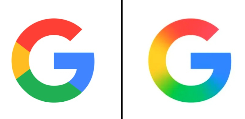
Google’s last branding update was nearly 10 years ago, when on September 1, 2015, the company changed its logo to Product Sans. The change transformed the small white “g” on a blue background into the four-color capital “G” that has represented Google to this day. Now, the company has refreshed the logo, replacing the four solid color sections with a smooth rainbow gradient.
Red flows into yellow, yellow into green, and green into blue, making the logo look like the symbolism of Google’s Gemini neural network.
The new logo is already being used for the Google Search app icon on iOS and the beta version of the Android app. In addition, the new design is being shown to Pixel smartphone users
Google has not said whether it plans to roll out the updated logo to other platforms. Google’s main six-letter logo remains unchanged.


